
Well Done kiddo!!!! It is great to see someone (especially a kid) taking the initiative to design AND kick starting his own YouTube channel. Regardless of whether your venture will be a success or failure, i am sure you will gain plenty of good experience and skills that you can apply to other situations later on in your life/career. You deserve a pat on the back for that!!!
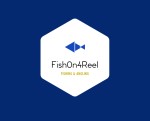
With regard to your logos - i much prefer the second one but perhaps you should take out the "FISHING" words located on both sides and make the shadow of the fisher hooking the fish much larger - everyone knows it is fishing related from your entity name "FishOn4Reel". I would also change the background colour to white with the fisher shadow in black and see if it is more pleasant on the eyes.
As to the reason why I am against the 1st logo, it looks way too busy - especially the hexagon box inside a squared shaped coloured box. Why should you have such a small logo of your name and wasted all the space for a blue background? Also, no need to have "Fishing & Angling" at the bottom - they know it all from your name. Btw, my Anglish is not so good but isn't Fishing and Angling sort of the same? Professor Bugatti - i need your help here
Best of luck young gun :thumbsup: :a_goodjob: :thumbsup: